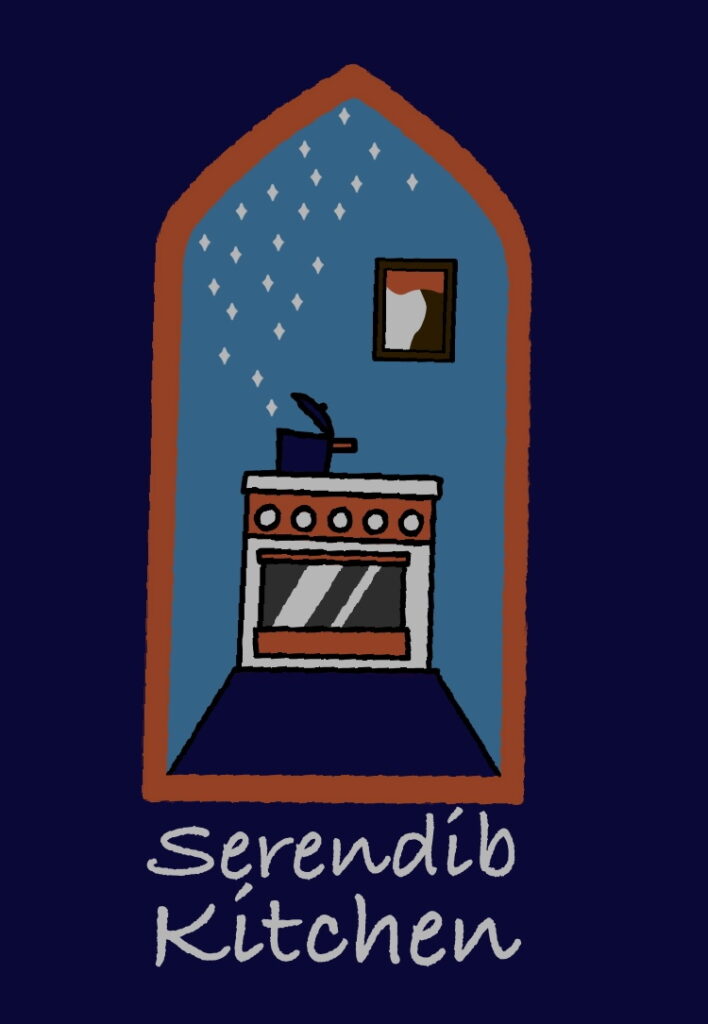
I think it looks pretty good! I could put this on a sticker that I’d use to seal a marshmallow package, or on a business card.
The colors are taken from Feast — we’re not wedded to them, but will probably go with something along these lines. Though could be convinced otherwise, maybe.
We’ve taken design as far as we can go, so keeping these basic elements, what might we do to improve it?
(Kavi says you should be nice to her in your critique. Feel free to be mean to me, though. Right now we are debating whether it’s tilted a little to the right or not. I think it is. :-))

