Spoonflower is Addicting

Happiness is shipping out lots of Patreon treat boxes + one special order. 🙂 I have to spend the morning on e-mail & teaching work, but this afternoon, more mask sewing!

And I have the most CHARMING new autumn fabrics from Spoonflower (that site, so addicting!), as well as Halloweeen fabrics (which will need to be ordered soon if you actually want them for Halloween), so watch this space.

Photos with detailed names and notes for all of those should be posted later today…but here, I’ll throw the thumbnails in here, just give you a sneak peek. So pretty!

The Coconut Grater

It hurt. That’s what I remember
about scraping coconut as a child,
struggling with dark metal clamped
to the edge of the kitchen counter,
afraid of the sharp grating blades.
My arm, unmuscled and unaccustomed,
ached after just a few cranks round;
my mother mostly offered critique,
rather than praise for my efforts. Too often
I would scrape and scrape, ask if I had done
enough. She came to inspect, sniffed –
there is so much meat left on there still!
I’d try again, and err in the other direction –
no, no – don’t scrape it so thin, you’re getting
husk in the coconut! Amma would have
excelled in a classic French kitchen,
exacting and precise, demanding perfection,
always disappointed in my failures.
I went away, and for years subsisted
without coconut. When I started to cook,
I bought sweetened coconut by mistake
in the baking aisle, and ruined a curry.
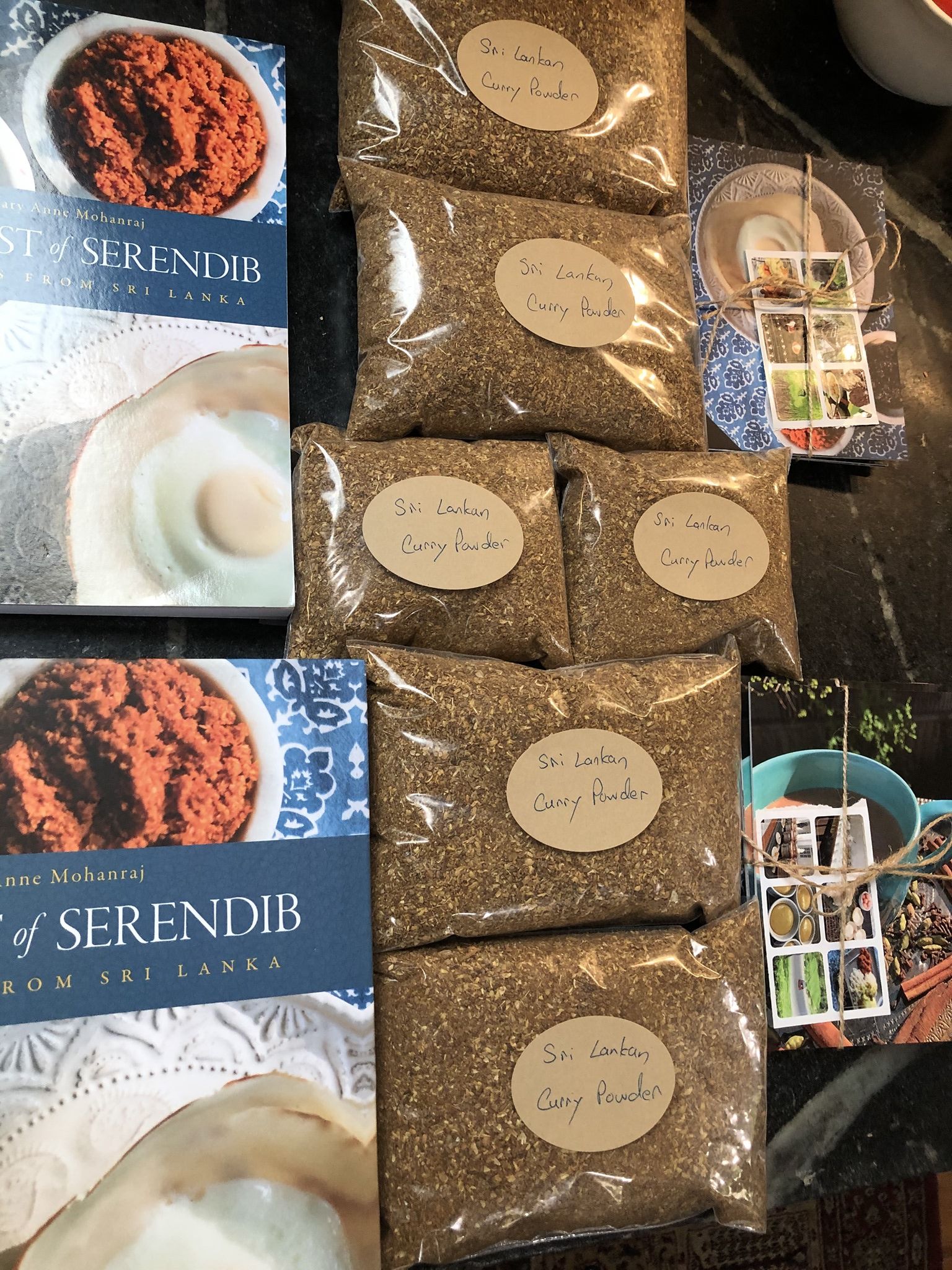
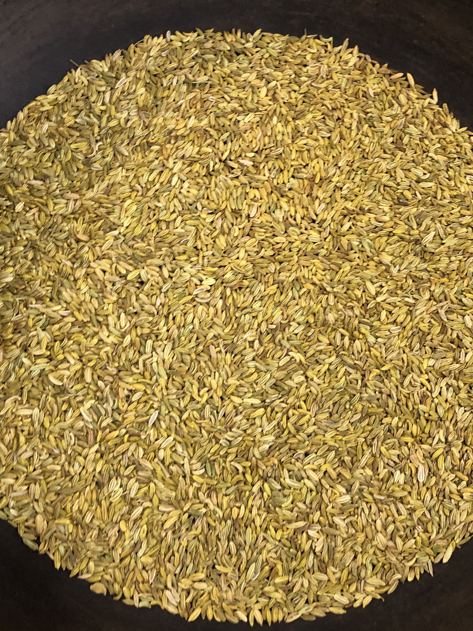
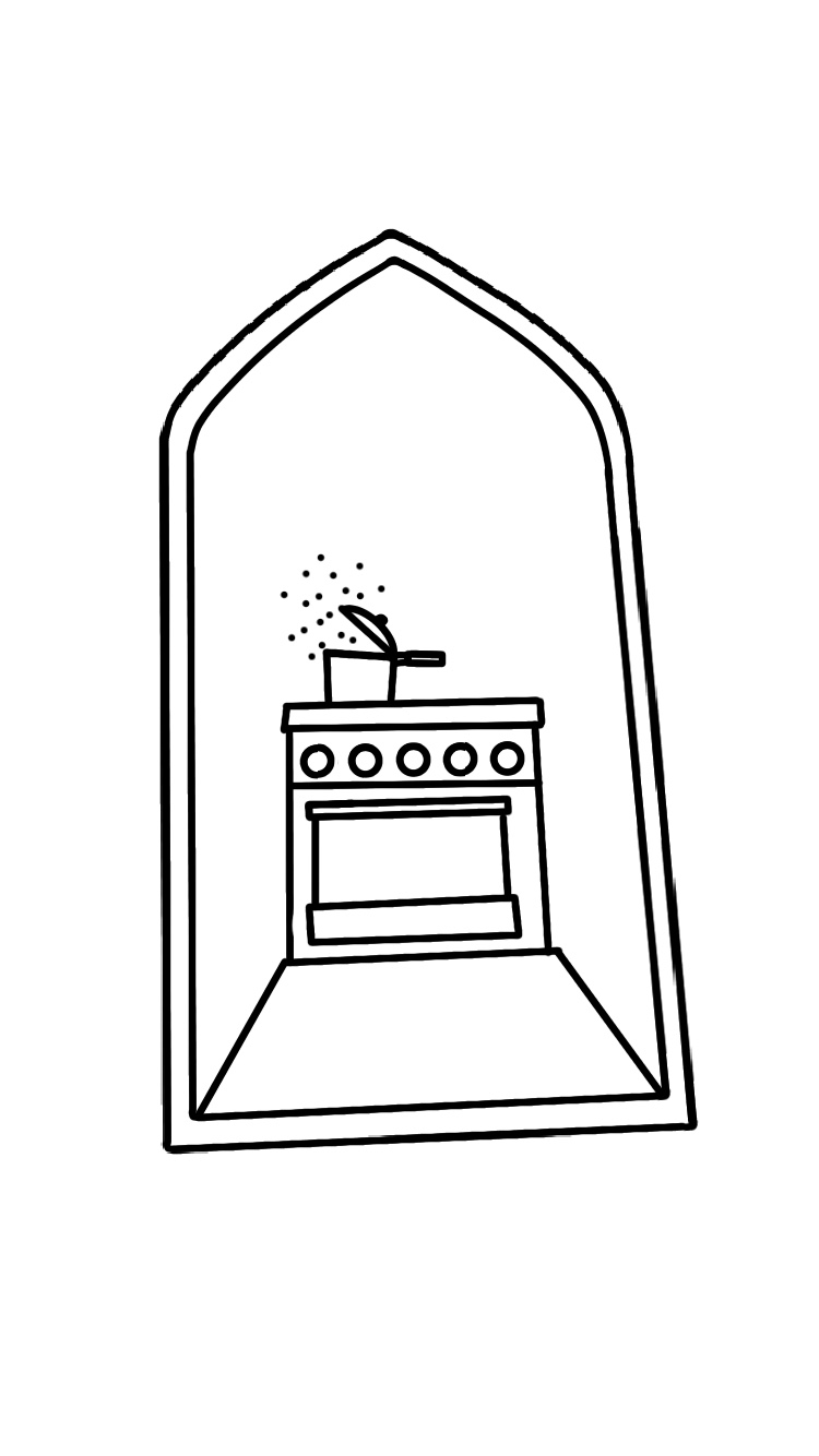
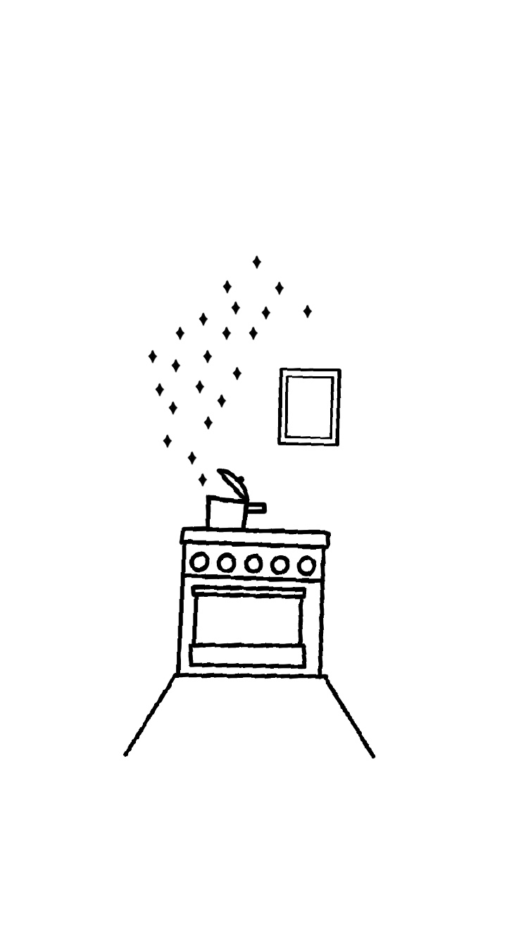
Eventually, I found dessicated coconut,
learned to rehydrate it with a little hot milk,
or better, coconut milk – just thirty seconds
in the microwave. Ammama, my grandmother
in the old country, had no such devices.
Frozen coconut is better, found on Devon or
in Westmont, where South Asians gather,
though once you thaw it, you must use it all
quick quick; it won’t keep long in the fridge.
Ammama didn’t grate her own coconut.
Labor was cheap; every morning, their cook
rose early to grate coconut for the day,
fresh from the tree. A little pol sambol to
accompany a fresh egg hopper, and another
servant chasing me around, begging me
to eat, just one bite, please. If I ate,
they could have their own breakfast, finally.
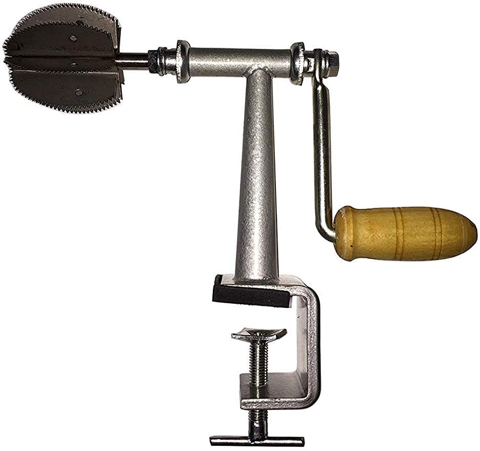
Now, living near cold Chicago, I shop online
for a coconut grater. I peruse suspiciously,
read reviews, trying to decide whether
to go old-school or modern in design.
A part of me doesn’t trust that ergonomic
will grate correctly; a little pain is required
to create the tastiest dishes.
When it arrives, I will try to persuade
my own children to help me grate
the coconut. Not because I need the help
of their unmuscled, unaccustomed arms!
But if they grind a little sense-memory
into their bones, then someday, maybe
they will buy their own grater, knowing
fresh coconut is best. It will sustain you

down the years, across vast distances.
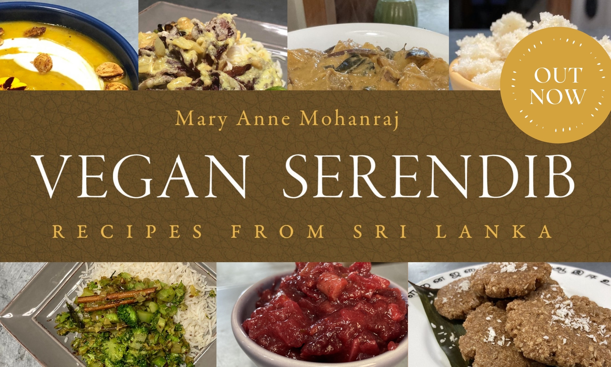
*****

M.A. Mohanraj
9/19/20

Logo Design, Draft 2

Kavi’s and my logo design for Serendib Kitchen, draft 2. I think it’s pretty close at this point to a workable draft! We invite your critique to refine it further.

The text is in my handwriting, which is not the most beautiful, but does gives some of that homemade charm, or at least so Kavi assures me.

The first is the actual logo. The second version, with the words on the rug, I’m not sure we’ll use, but it did make me laugh because it reminds me of the Star Wars scroll, so wanted to share it.

The circle is just starting to futz around with what might make a nice small image for a sticker or a design element on a book or some such. I think we’re going to make the line weight heavier on the SK — I was getting sleepy at 11 p.m. last night, so I made her stop working…

As a side note, I’m really liking collaborating with her on art stuff — we’re working on a 2021 tea towel calendar for the next Spoonflower design contest now — and I’m now thinking that if we keep doing a lot of projects together, maybe we need our own little design studio that has a different name, not Serendib, to make clear that it’s at least half if not more her. Something to think about. 🙂

Like a Freight Train

I made up little packets of apology postcards and stickers to go out with these book / curry powder orders. Sorry they took a few weeks longer than normal, folks. The semester fell on me like a freight train, but I’m getting up now. Whew.

Isn’t This Lovely?

Isn’t this lovely? One of the people we gave away a cookbook to left me a bouquet of flowers on the porch!

Totally unnecessary — that book was paid for by another generous soul. But that’s not going to keep me from enjoying the flowers. I think I’m going to take them up to Kavi’s school-at-home desk tomorrow, so she can enjoy them for this week of e-learning.

(I would give Anand a bouquet for his school desk too, but the odds are very high that he would knock it over and spill water everywhere. He has a nice succulent, though, in a Pokemon-themed Bulbusaur planter.)

Toasting

So much toasted coriander. So much toasted cumin. (I’m out of cumin now, need to make a run to Pete’s sometime soon. Can I bike that far? I think so. The real question is, when is the store nice and empty….?)

The Scent Is Divine

Toasting a big batch of spices for homemade Sri Lankan curry powder tonight. (We dark-roast our spices before grinding.) I think my favorite part is when the fennel starts to toast up, that nutty licorice scent is divine. 🙂

Kavi Helped Make Me a Logo!

I think it looks pretty good! I could put this on a sticker that I’d use to seal a marshmallow package, or on a business card.

The colors are taken from Feast — we’re not wedded to them, but will probably go with something along these lines. Though could be convinced otherwise, maybe.

We’ve taken design as far as we can go, so keeping these basic elements, what might we do to improve it?

(Kavi says you should be nice to her in your critique. Feel free to be mean to me, though. Right now we are debating whether it’s tilted a little to the right or not. I think it is. :-))

Designing a Logo for Serendib Press

Kavi and I spent a while this evening working on logo design for Serendib Press. It was a collaboration, but she did most of the actual work!

  • the first sketch is hers, based on me talking about what I wanted to be in the image
  • the second is mine — I wanted to try filling out the scene a little, straighten the edges, etc.
  • the third is where Kavi took over, and I just served as the client, giving her suggestions — I can do some of the things she can do in Procreate, but not a lot of it, and she’s much much faster
  • the fourth is after we took out the outside border so we could straighten it, and added a window for balance, and gave the stars more presence, like steam rising out of the kettle
  • the fifth is we started playing with color, using the colors on the cover of Feast as a jumping off point, for cohesion

I’m going to ask for critique in the next post, so we can iterate a little further, but for this post, I wanted to show the collaboration process. And also brag on my kid a bit.

I told Kavi she’s getting paid for her work on this. What do you think a 13-year-old logo designer should get — same as adult? A percentage? Inquiring minds want to know!